Be sure to check in on what I'm up to here on Newgrounds. Here I make a news post on what I doing every two weeks so, check in for all the latest from me.
So I took a bit of break from Project Honey, I was feeling a bit burnt out. Boy I'm glad I did. Things are going good once again. There were a lot of little design things that kept me from really accomplishing anything, I'll go over a couple of issues I've solved and how things are coming along.
One of the biggest issues plaguing the project was... But what is the point of the game, not story wise, but game play wise. What is the player trying to do? I always had a decent enough Idea of that. But I'm trying to make project honey a smaller game, atleast for now. Get something that's fun and playable and sexy, and then I'll worry about making it bigger if I so choose. As it was, the game just didn't work as say a single level, quick game. And to be honest didn't work period. It was too slow, too hard, Alot of waiting around. Not enough action.
The solution was not a simple one. For one, I wanted sex to be like a minigame, do it and you get a reward. But it took so long. in order to deal with a large group, you'd have to play the same minigame over and over, not ever changing much at all, It would take a long time. I thought, well what If i made it so that multiple characters would be apart of the minigame...? Which would be fun idea, but It would increase my work load by a LOT! I'd have to make 2 character sex scenes, 3 character sex scenes.... maybe more! This was a no go. So instead I ditched the mini game. Sex just happens. you can basically skip through the whole thing if you want, take your time if want, The pace is up to the player. I made them less like the qucik time kills in God of war and more like the glory kills in Doom 2016 if that makes sense to you guys.
Next was Health. I wanted it so that in order to have sex you gotta jump on em' to open em' to you. This was fine, but It meant that the best option was to deal with enemies that were in your way first to get to the one you wanted to actually have sex with which... wasn't alot of fun and contradictory to kind the whole point of the game.
You had deplete an enemies hp before you could have sex with them. But I didn't want them to just sit around waiting, so I had them pass out after 10 or so seconds, other wise the game would be too easy and not very sporting and way to rapey for my taste. The player functioned largely in the same way. Health gets depleted, game over.
Instead I decided to change it so that if you lose all your health you get dizzy, after a few seconds you get back up with some health restored, until you run out of stamina. which point you get knock out and it's game over, same for the enemies. I also made it that you don't have to wait for health to be deplete just when the character is stunned some how, be they dizzy or just took a bonk. This way things got by much faster, there's more skill and stratagey involved and the enemies can turn the tables and have initiate sex themselves.
Over all I'd say it's more fun and better paced.
Next were a few issues are with graphics. As of version 4.26 Unreal Engine supports anisotropic shading... to bad I'm not using 4.26. 4.26 introduced a progress halting bug that as of yet has not been fixed. Early on I fell victim to it, so I switched the project to an earlier version of the engine. The reason this is an issue is hair.
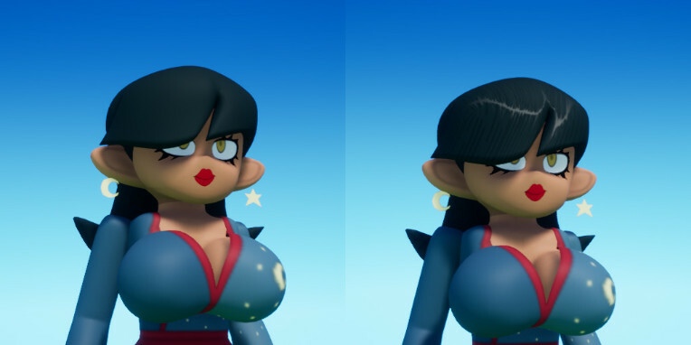
Left: Old Hair Shader, Right: New Hair Shader.
Stylized rendering in UE4 is a real challenge. Not impossible mind you, it's just the engine wasn't built with that in mind. It does do hair really quite well, that is realistic hair. The problem with the built in hair shading is that it's too realistic, it looks nice but it's not what I'm going for. Also it doesn't really work for way I'm doing hair, one big piece rather then individual strands which introduces artifacts.
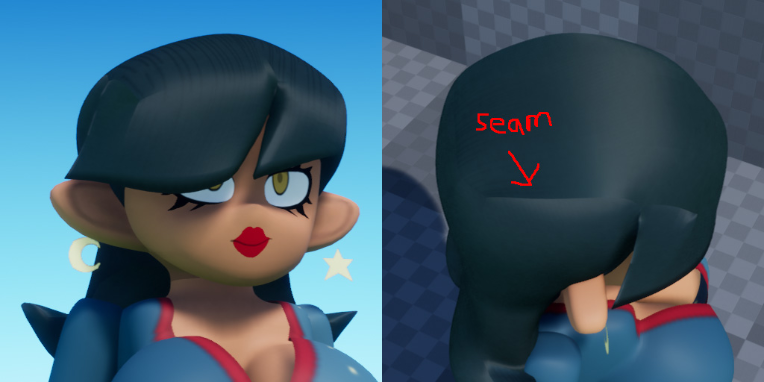
Built in Hair Shading, nice but not going to work for me.
Faking hair shading is actually quite easy. Get a texture for the highlights , warp it a bit based on the view and boom, hair highlights, problem is you'll also have highlights in the dark too.
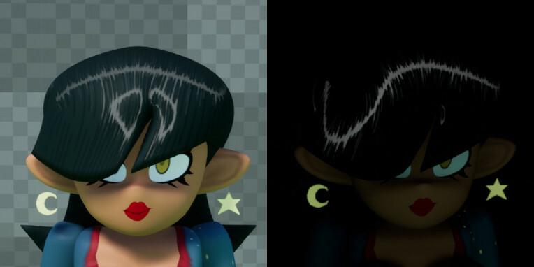
Hightlights in the light and the dark
There are a lot of solutions to this problem, create a global variable that controlls the highlights so they turn off in the dark. Make it apart of the hair texture so it's less noticeable in the dark. don't use highlights for hair. But none of that was gonna work for me, I wanted a solution that complement the tools already in UE4, I want to take advantage of lights already in the scene. the solution above assumes a single light direction and a single light color and intensity. It doesn't know anything about the lights in the scene or shadows or anything like that.
It was around this point that I was basically just gonna give up on hair, it didn't work well enough or look good enough to justify it. IF ONLY THERE WAS A WAY I COULD TELL WHERE LIGHT WAS COMING FROM IN A SCENE AND HOW MUCH!
Why not raytrace?
SO i did!
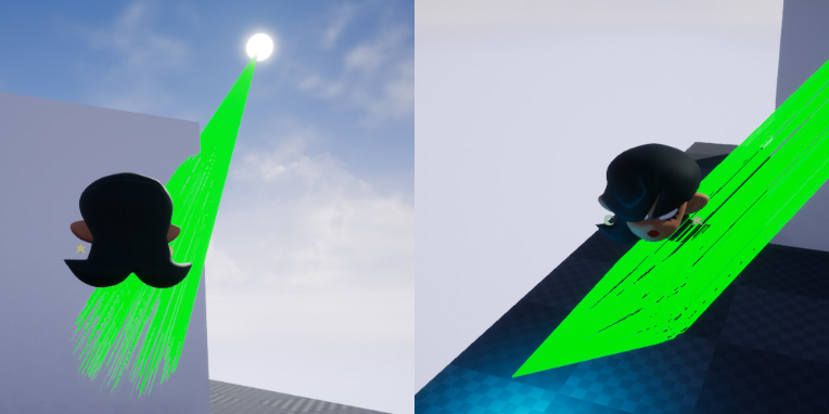
1. Trace rays to relevant lights in the scene. 2. ??? 3. PROFIT
The solution was really simple, each light would contribute a small part in the light color, intensity and direction. By finding an average of all the relevant lights I could easily get decent approximation of the scene lighting, Now if tracing a bunch or rays to every light sounds expensive, That's cause it is! But by limiting my ray counts and doing some simple temporal denoising and disabling the effect on far away characters, the hit to performance is minimal. The results speak for themselves.
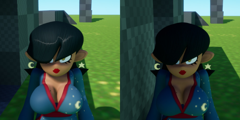
Correct Direction and color of highlight in the light and no highlights in the shadows.
It's a small detail but I feel it's worth it in the end.
But to close things off I wanted to share one new design I'm working on, She's one of my favs so far. No name just yet.
See y'all again soon.
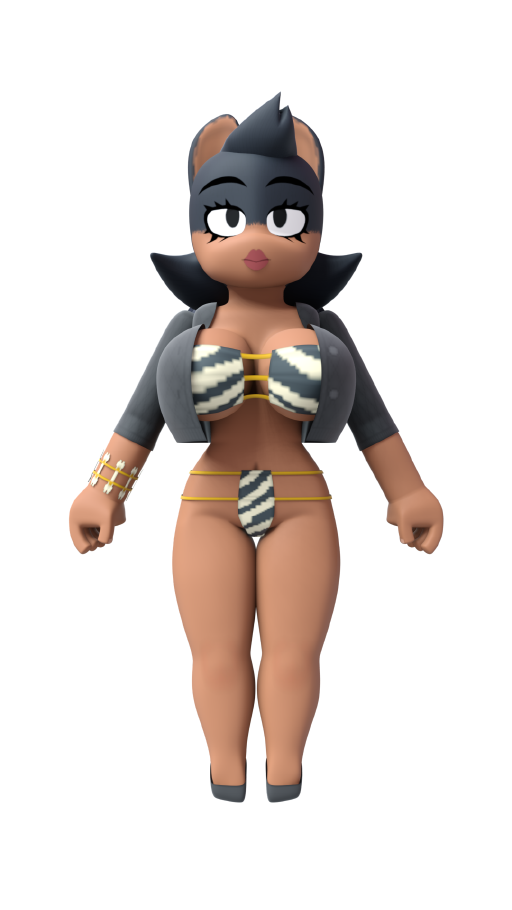
No she does not resemble a character you might already be familiar with, HOW DARE YOU!